Source:BODA2023-02-24
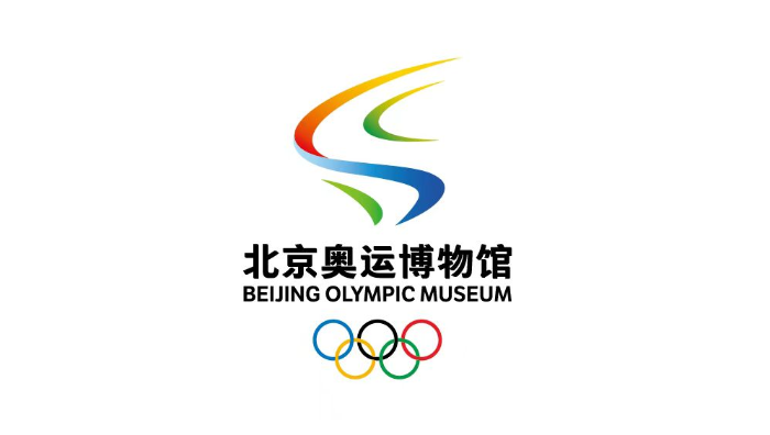
The new logo drew inspiration from ribbons, wings and tracks to form the shape of the Olympic flame. Its main body is composed of red and blue ribbons, representing the convergence of the Chinese dream and the Olympic dream, and of two tracks: the red ribbon represents the athletic track of the 2008 Olympic Summer Games, and blue one represents the ice and snow track of the 2022 Winter Olympic Games. Red symbolizes the fiery passion of the Summer Olympics, and blue the icy purity of the Winter Olympics, and the fusion of ice and fire is the best way to show Beijing as the only Summer and Winter Olympic City. Above and below the main body are two green ribbons, echoing the vision of green Olympics. The green ribbon at the bottom represents a green leaf, representing China’s remarkable achievements in building a green ecological environment for the two editions of Olympic Games, while that on top symbolizes China’s commitment to sustainability and to maximizing the benefits of the legacy of both Summer and Winter Olympics in the post-Games period for Beijing.
The dancing lines of the logo make it full of vitality, embody the Olympic motto of “Faster, Higher, Stronger – Together,” and imply the cultural and spiritual heritage carried by the Beijing Olympic Museum. The spread wings echo the “Flying” sculpture collected by the Museum, pay respect to the Olympics and the Chinese nation, and symbolize the vision of a world where all the peoples live in peace and harmony together. The graceful and elegant ribbons skillfully form the shape of the racetrack, look trendy and youthful, and appeal to the global audience, representing the athletes’ fighting spirit and passion, and the sportsmanship of continuously challenging oneself and pushing the envelope.
The logo uses the colors of the five rings, with a mix of cold and warm color shades: the red and yellow gradient symbolizing passion, blue symbolizing the world of ice and snow, green the color of life, and black, depicting a colorful world of harmony and common prosperity.
The abstract shape of the Olympic flame is the soul of the logo. The glowing flame seems to outline the figure of an Olympic athlete striving and challenging himself, demonstrating the unique charm of Beijing as the only Summer and Winter Olympic City, and indicating that the spirit of the Beijing 2022 Games will be passed on forever.


© Copyright 2020. All rights reserved
Beijing Olympic City Development Association.All rights reserved.Beijing ICP 13521520 No.